User Guide
Supported Visualizations #
Yavin provides much more than static charts. Yavin provides a wide array of interactive visualizations that help you explore your data.
When you change the dimensions for a report, Yavin displays the available visualizations for the combination of selected dimensions. You can select the visualization you prefer by clicking among the different visualization icons  , which are located at the top of the report.
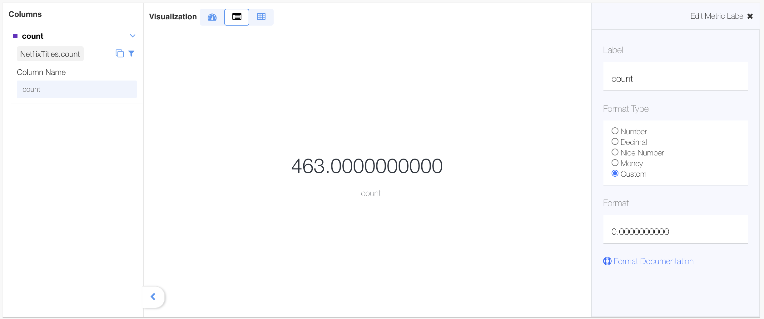
Measure label #
This is an overview visualization that’s shown when there are no dimensions selected for the report. It presents a numeric summary of the currently selected measures, applying any selected filter criteria.
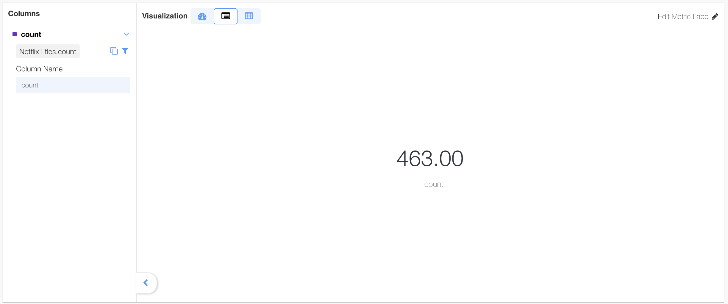
The measure label can be edited to change any of these items: Label, Format Type and Format
Gauge Chart #
The Gauge visualization is a chart that displays the major contributors or key influencers for a selected result or value. The Gauge chart displays progress toward a measurable goal.
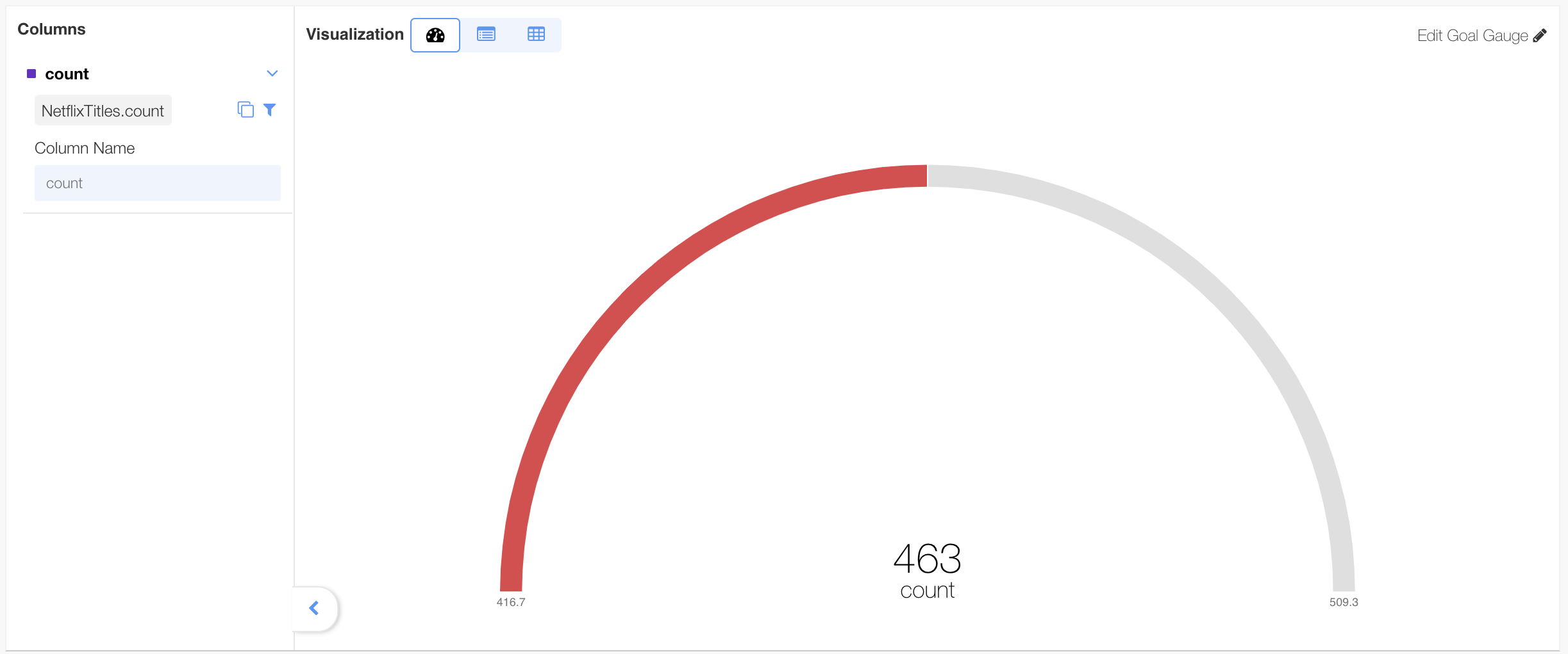
The gauge chart can be edited to change any of these: label, baseline and goals

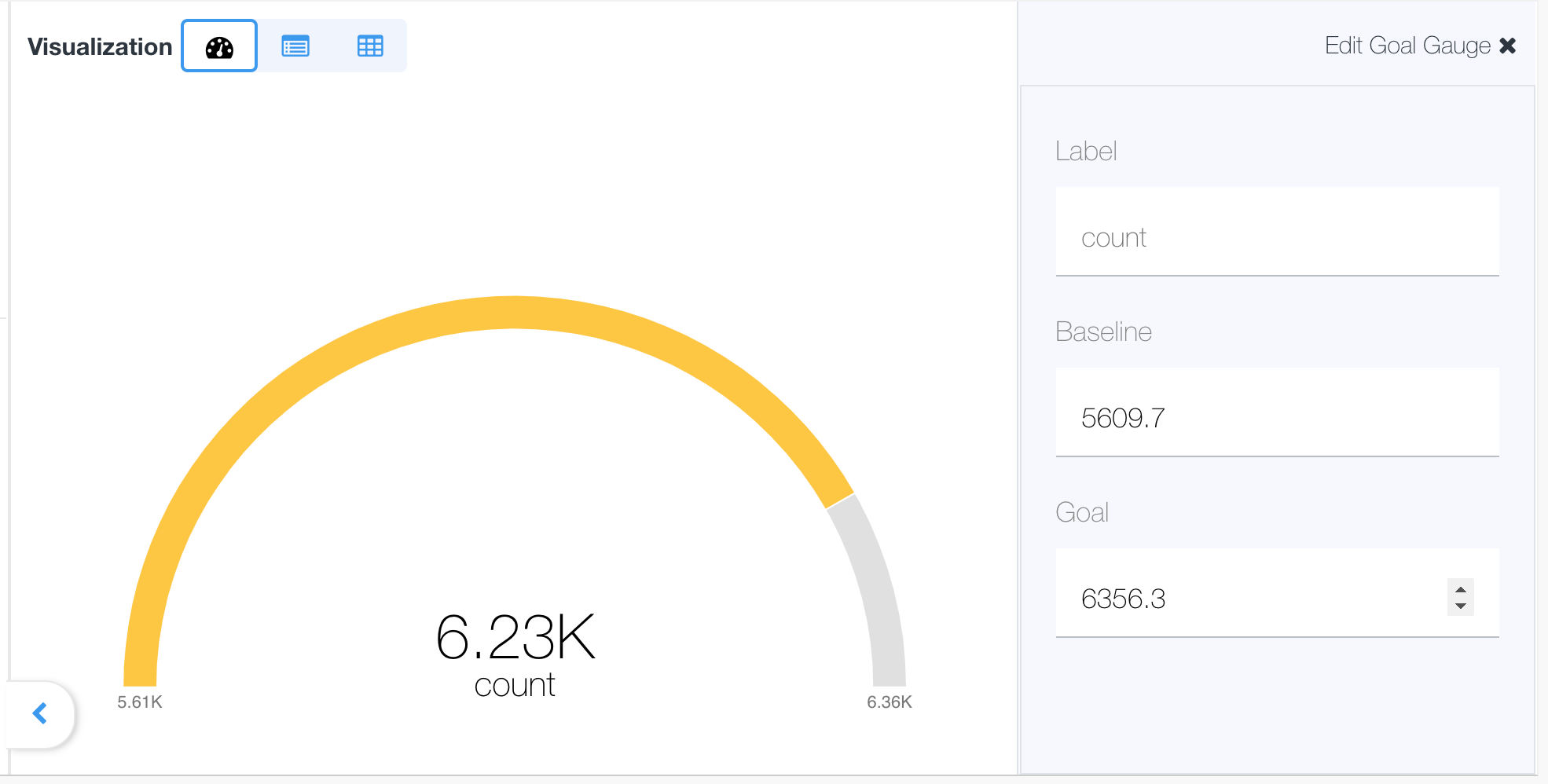
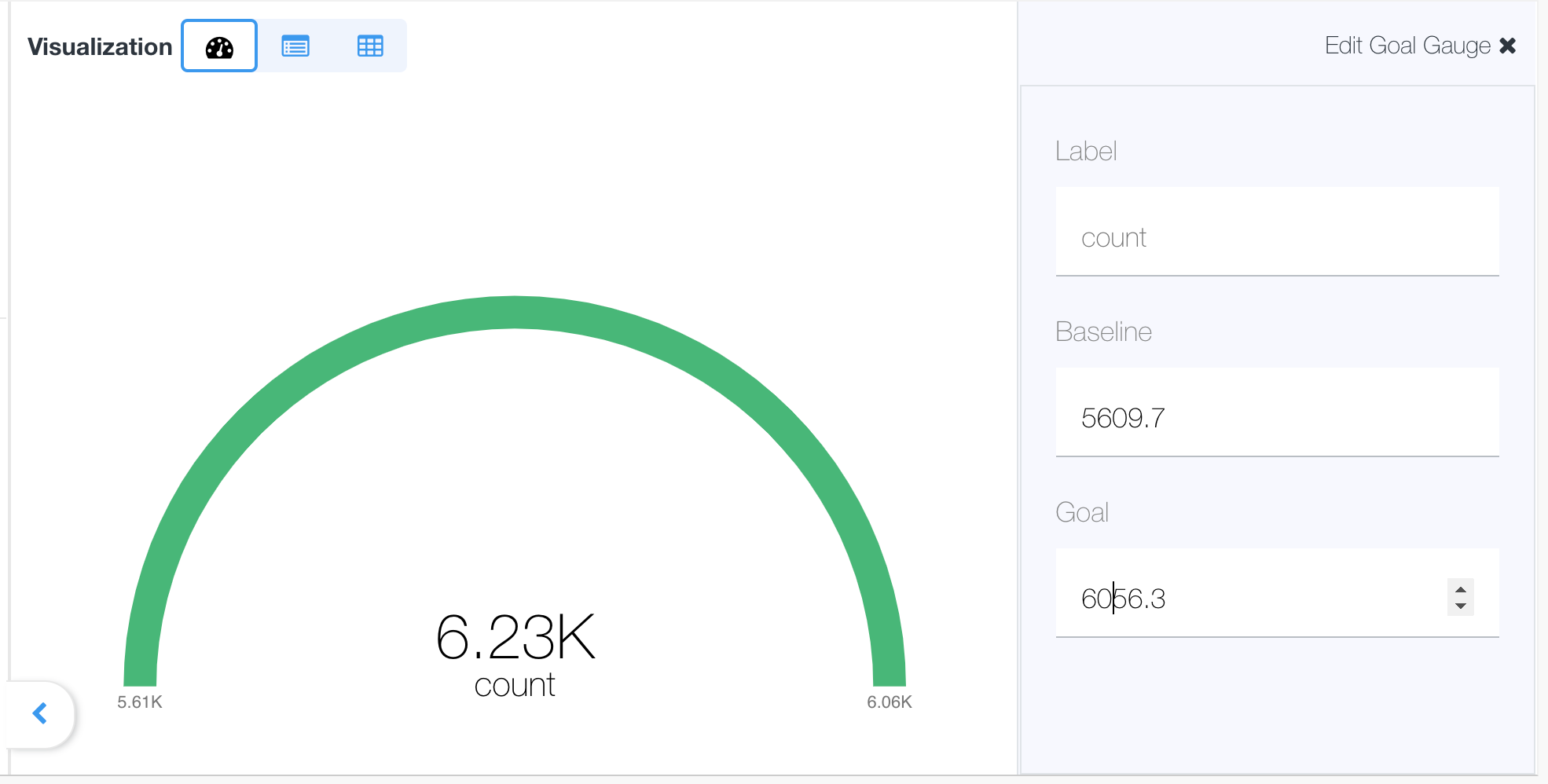
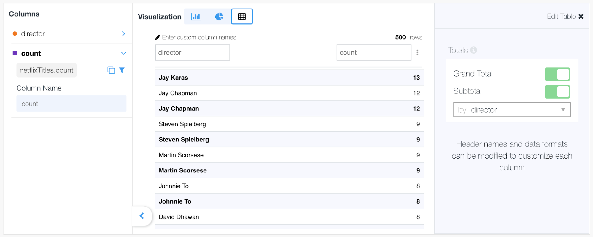
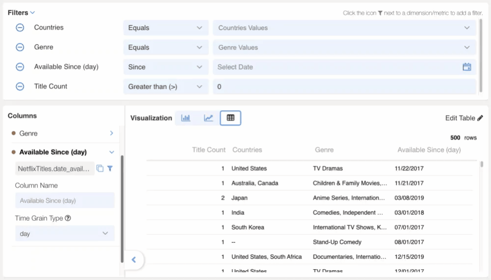
Table #
The table visualization is the default view when a dimension is selected. It presents a tabular view of the data with column ordering and sorting functions.
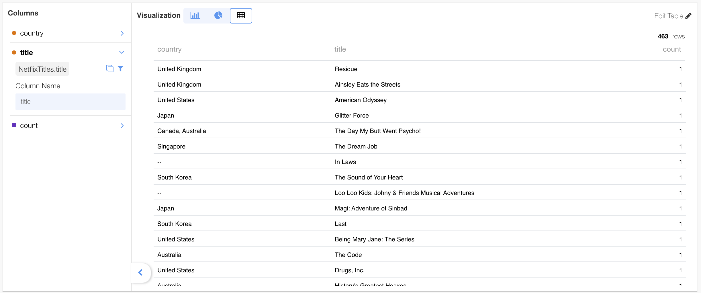
The table visualization can show multiple dimensions measures and dimensions together:
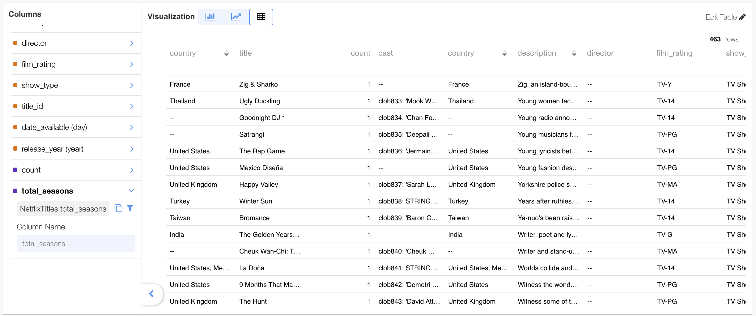
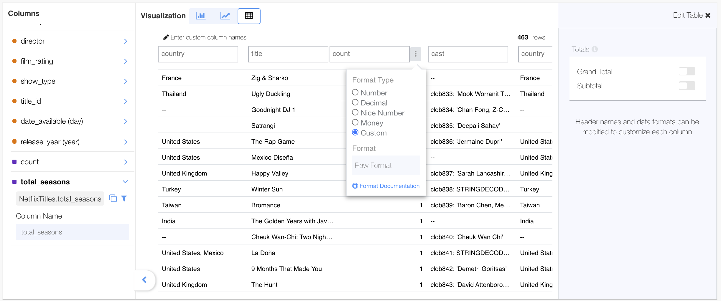
The table properties can be edited, including changing the column name, the format type, the format, the layout and the sort order of the columns.
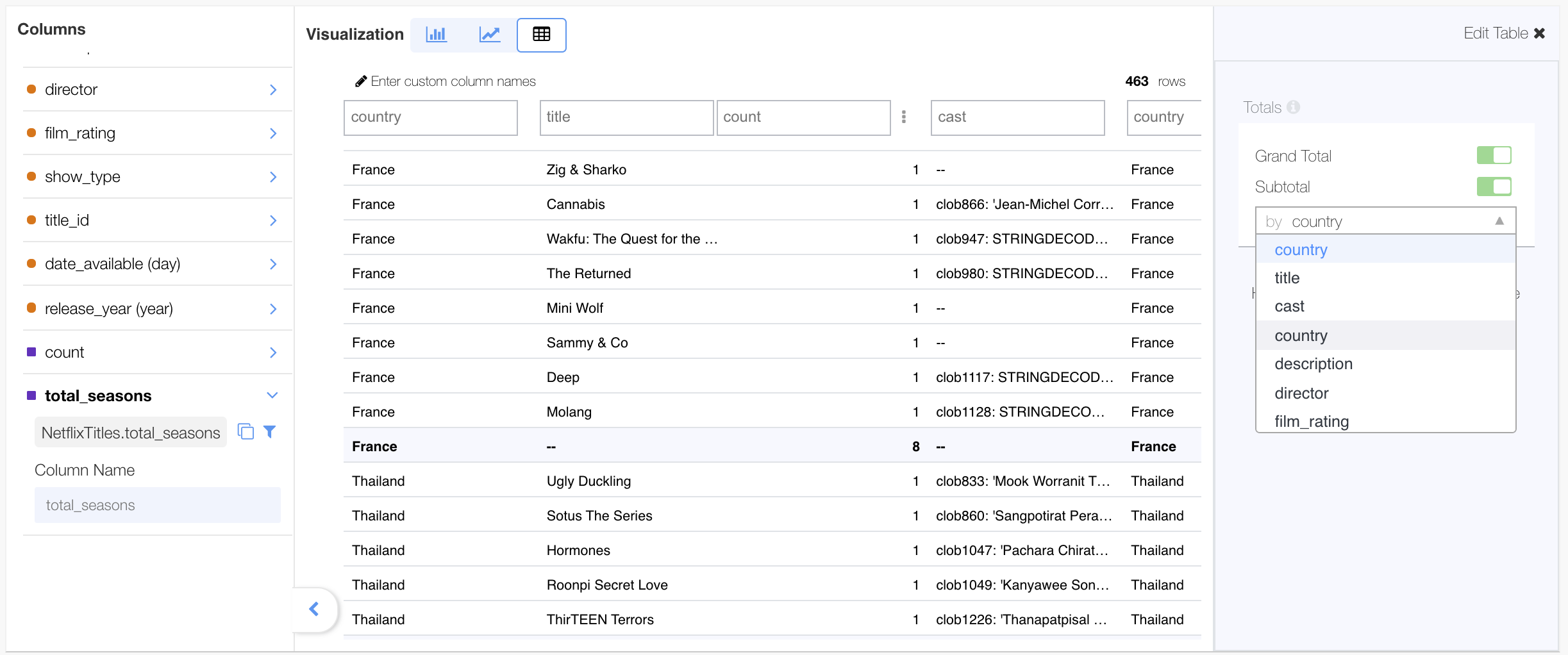
“Grand Total” and “Subtotals” of measures by dimension, can be added to the table calculation if desired. The option to add them can be done from the ( ) option.
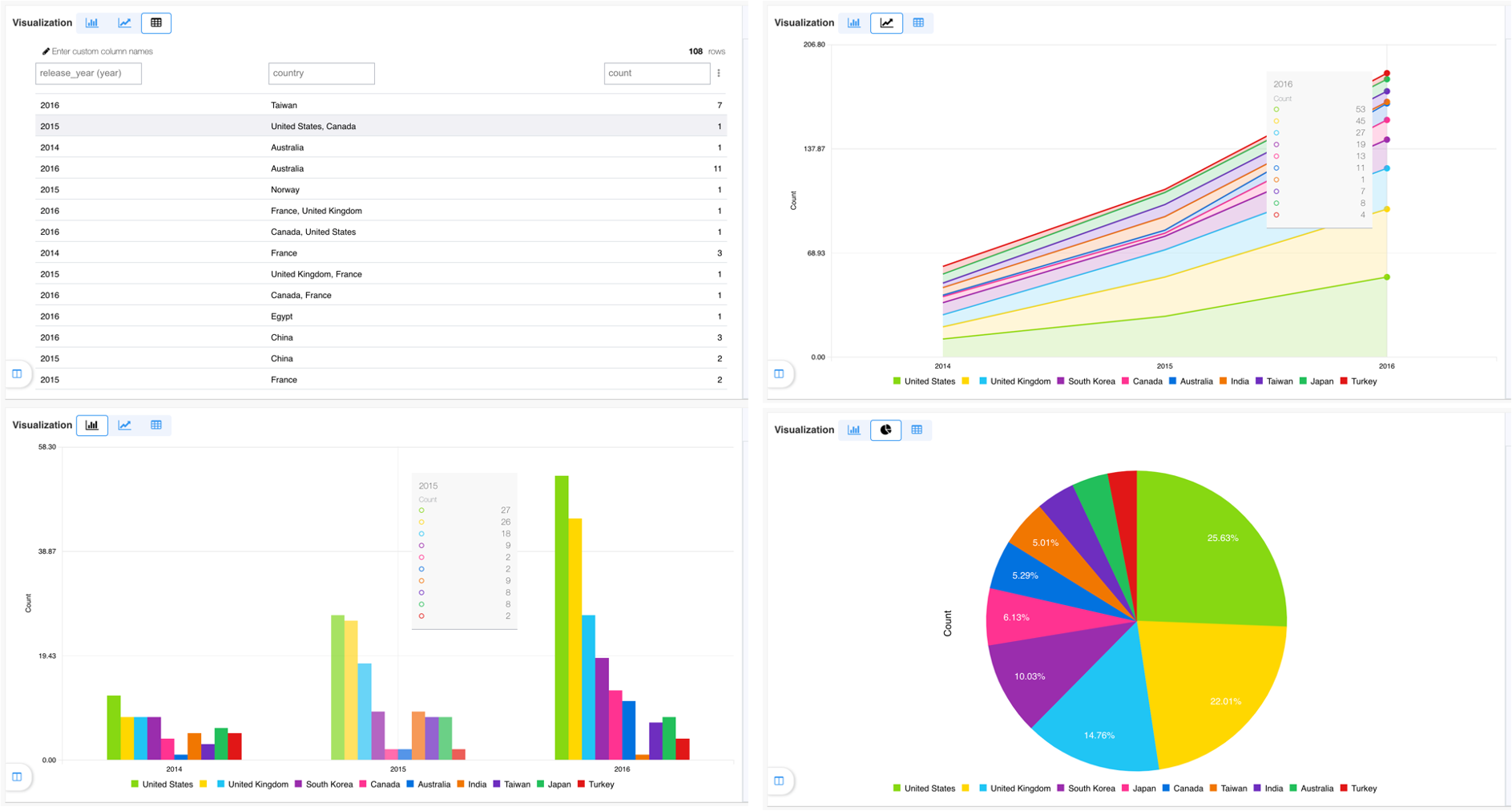
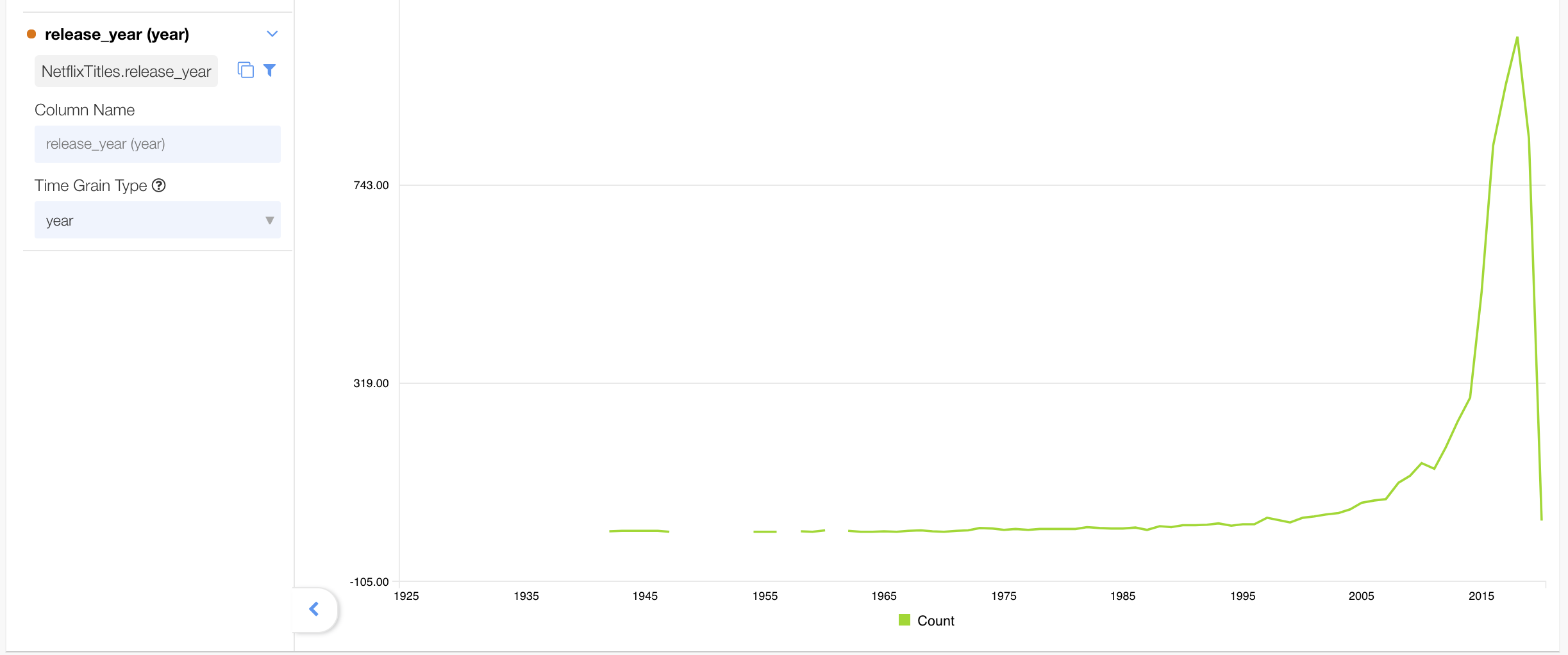
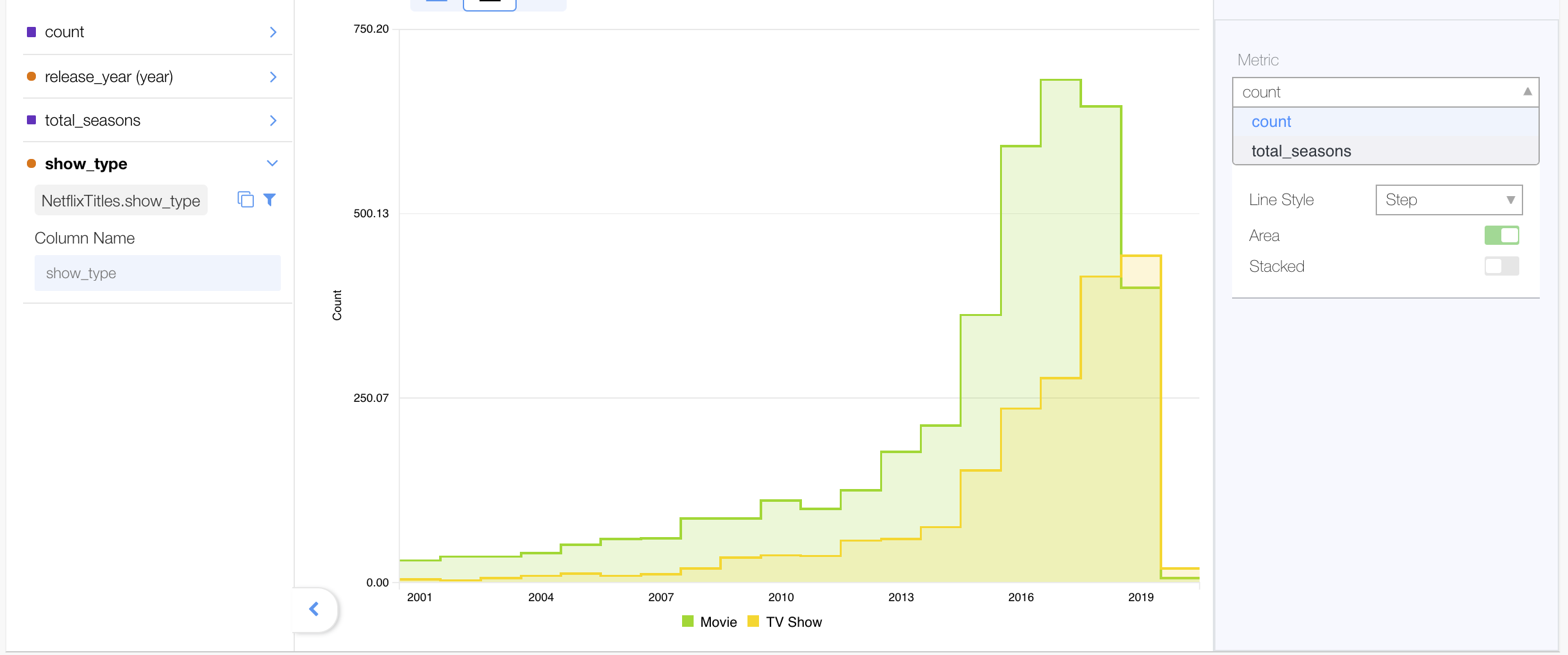
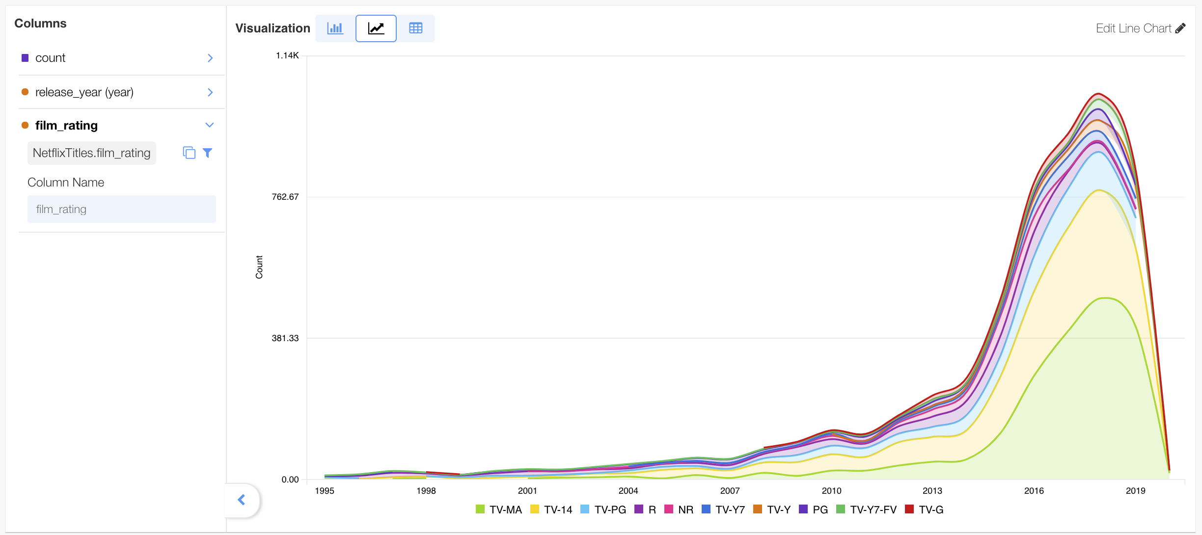
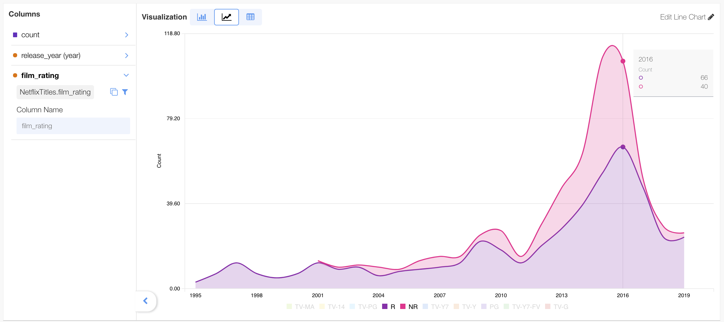
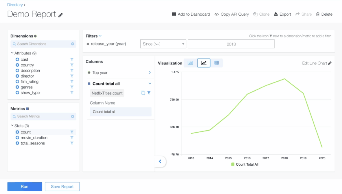
Line chart #
The line chart can visualize temporal (trend over time) dimensions.
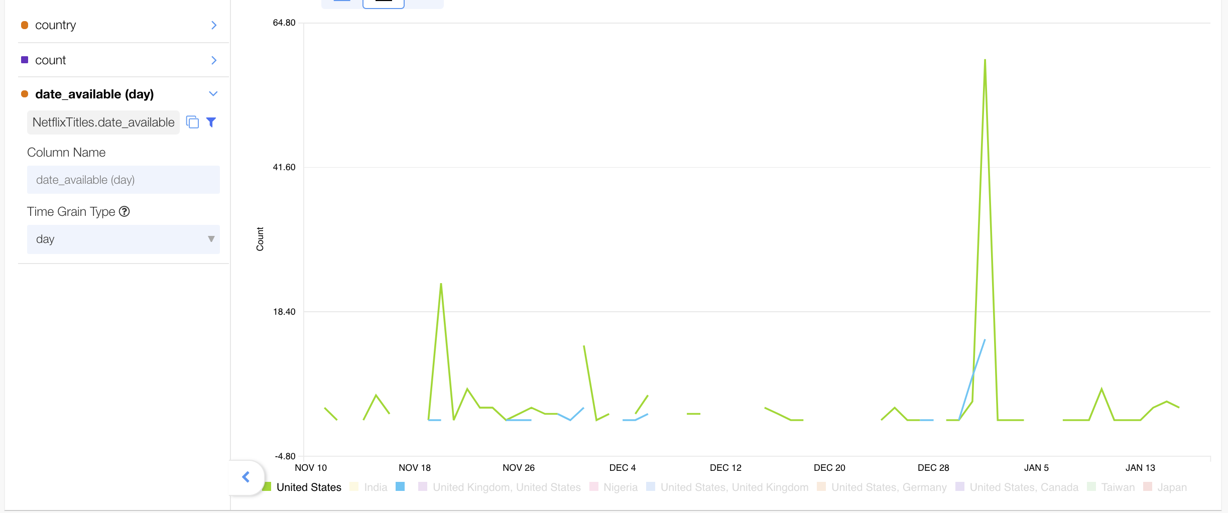
The chart lets you visualize multiple trends together in a single graph. Note the different colored lines in the chart below. They each chart an individual dimension.
The line chart line style can be changed to an area spline. The stacked area chart is similar to the regular line chart, and can be used in similar situations.
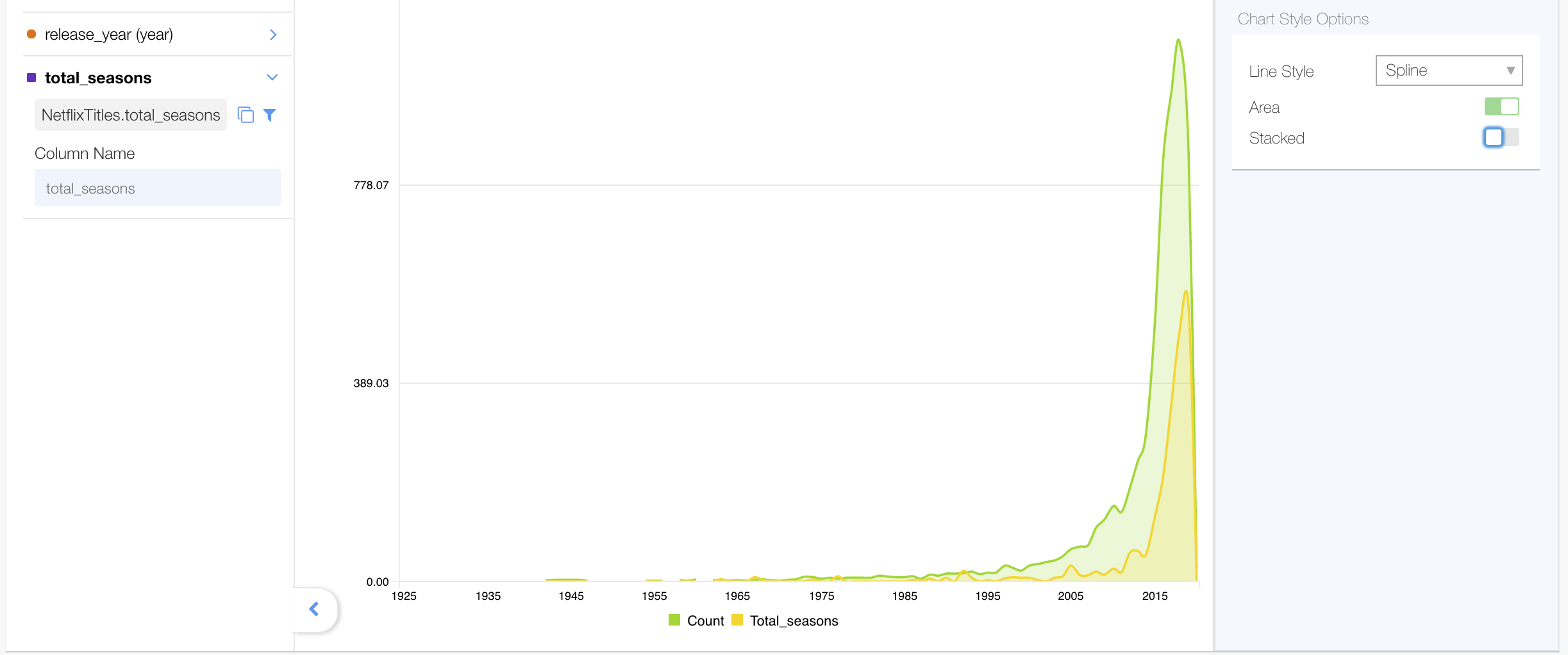
Or an area step
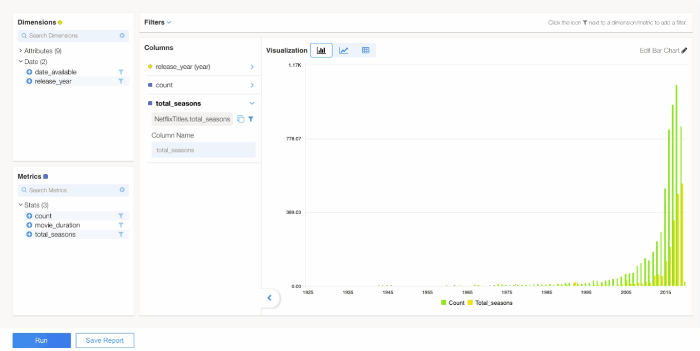
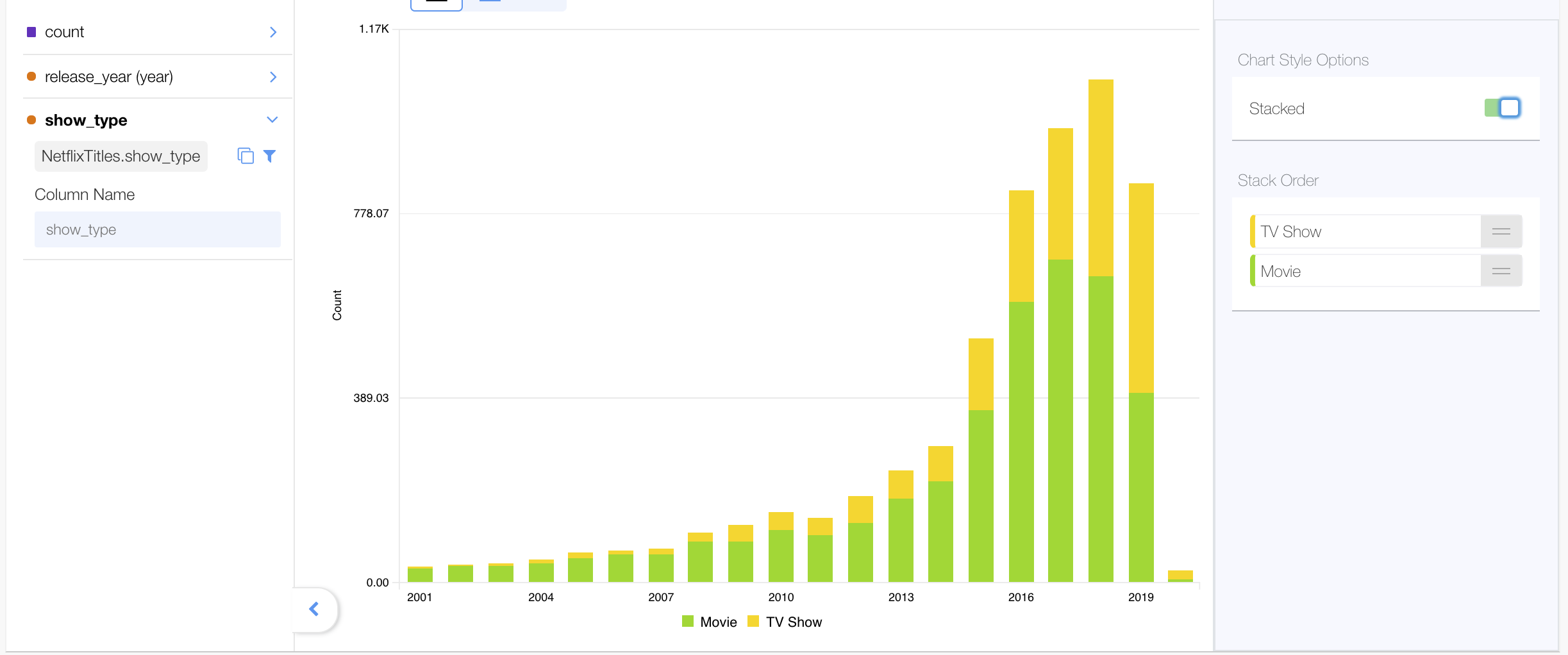
Bar chart #
The bar chart can visualize histograms - showing the frequency distribution of occurrences over numeric buckets.
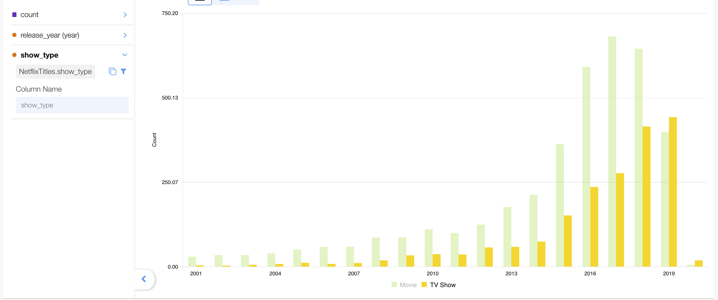
The bar chart can be edited, allowing you to change the measures and having them stacked:
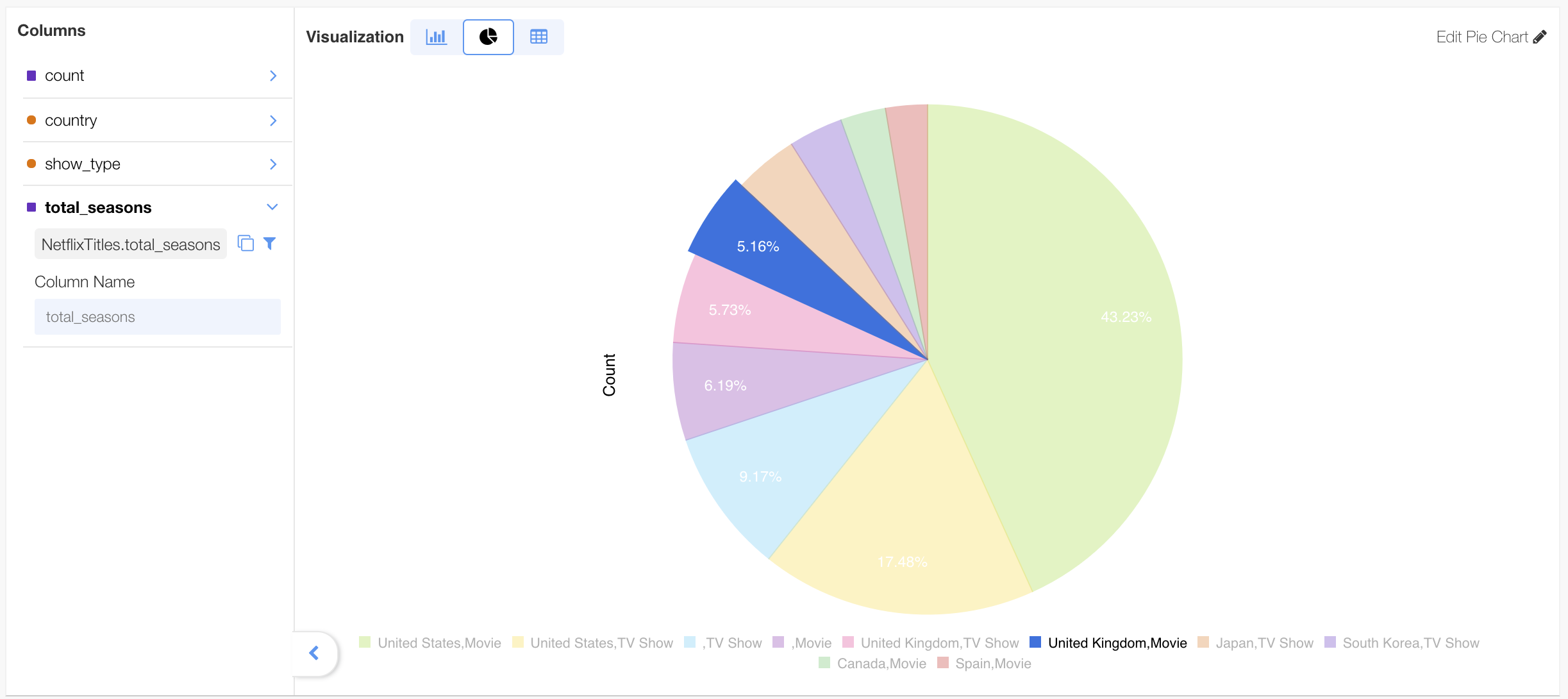
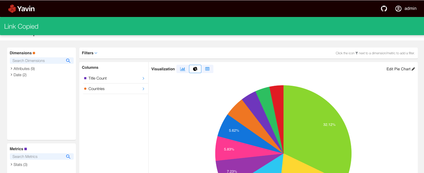
Pie chart #
The pie chart is a visualization that represents the ratios between the values of a dimension.
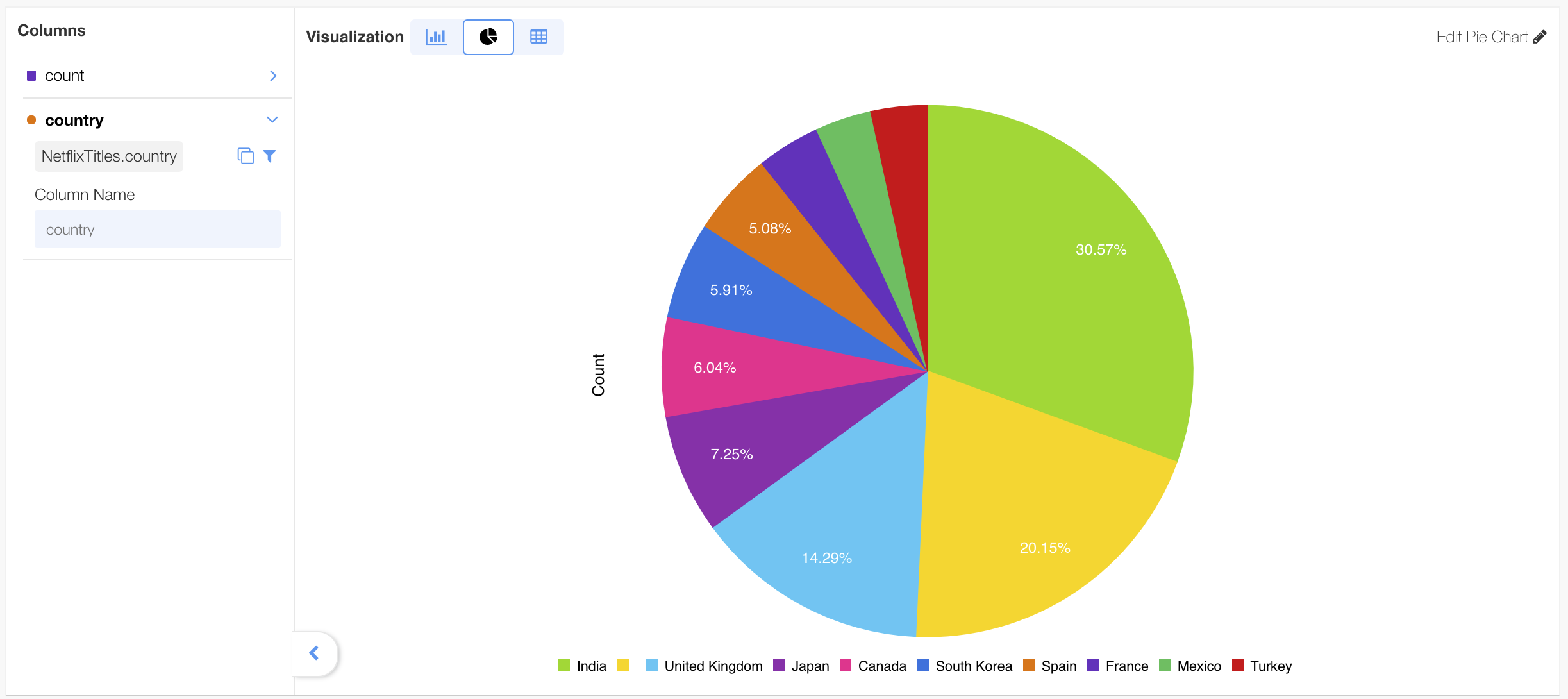
The pie chart can be edited, allowing you to change the measures:
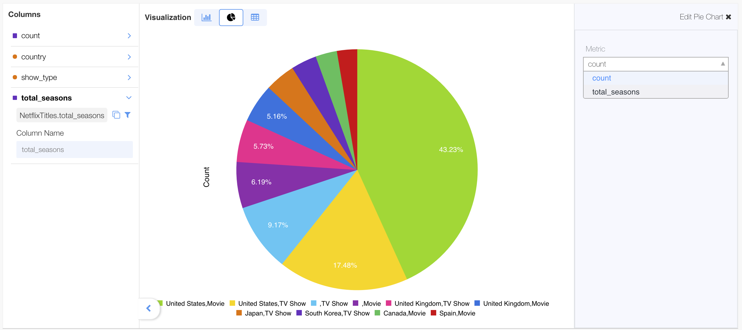
When there are multiple dimensions being rendered, the label below the chart shows the dimensions that correspond to each slide of the pie. Clicking on a slice will highlight the selected label in relation to the other slices.
When can you select each of the visualizations? #
| Visualization | When is it available for selection? |
|---|---|
 |
When no dimension is added. |
| When no dimension is added. | |
| Table visualization is available in all cases. It is the default visualization. | |
| When at least one time dimension is added. | |
| When at least one dimension is added. | |
| When there is no time dimension added. |
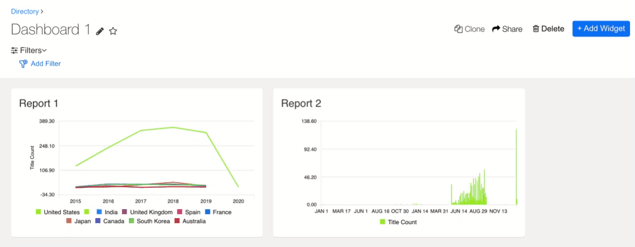
Time Series #
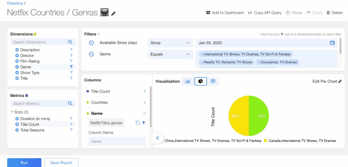
It is often useful to compare the values for different dimensions over time (time series data). A time series is a sequence of numerical data points in chronological order. To visualize time series data, specify a time interval - an inclusive start and exclusive end time/date. In the example below, total clicks is compared across gender over a period of 90 days.
The time series can be filtered further to focus on one or more specific dimensions. For example, the time series chart below narrows the focus to only “Male” and “Female” gender, hiding “Unknown” and “All Other”.
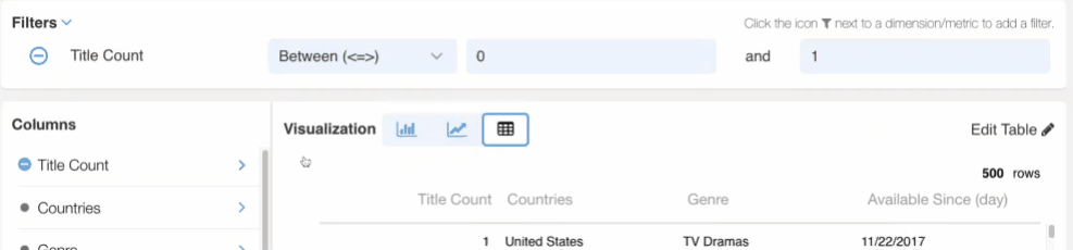
Filters limit the data returned in a report. A filter could limit a period or time, a certain country or a number of countries, or any other dimension value in your data. Filters are created in the filter bar. Users can filter by either dimensions, measures, or both at the same time. It is often useful to filter out outlying data and edge cases.
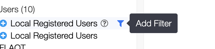
To add a dimension or measure to a filter criteria, select the filter icon next to the measure or dimension.
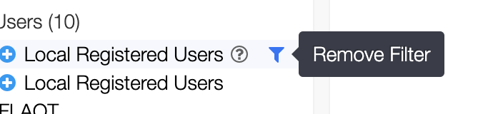
To remove a dimension or measure from the filter, click the filter icon for the corresponding Dimension or Measure. Or select the (-) icon on the filter section.
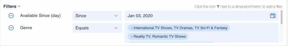
Editing filters #
Users can edit filters in the filter section of the report. Some dimension filters support “Type Ahead” search. Type ahead search is a feature of the search bar where user search terms are matched to suggestions as the user types. Type ahead search is only supported for dimensions with text values and must be specifically enabled in the semantic layer.
The example below demonstrates editing different types of dimension filters:
Supported filter operation for Dimensions (String filters) #
| Operation | Availability |
|---|---|
| Equals | Now |
| Not equals | Now |
| Is Empty | Now |
| Is not empty | Now |
| Contains | Now |
Supported filter operation for Measures (Number or range filters) #
| Operation | Availability |
|---|---|
| > | Now |
| < | Now |
| = | Now |
| != | Now |
| < = > (in between) | Q1 2020 |
| !< = > (not in between) | Q1 2020 |
| >= | Now |
| <= | Now |
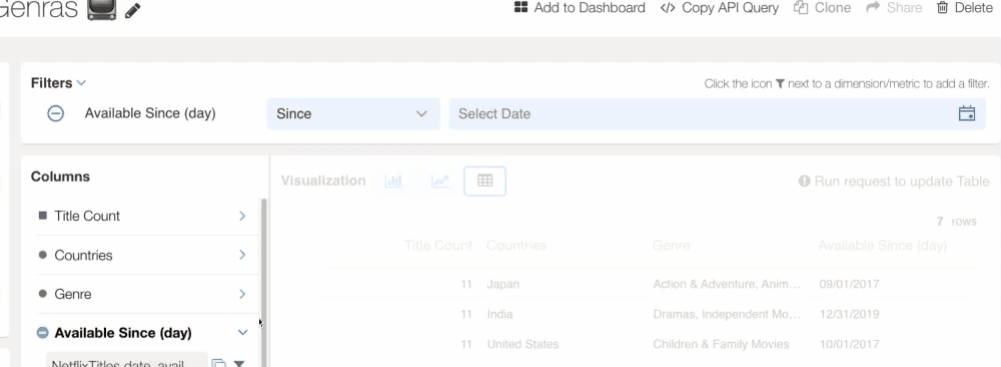
Supported filter operation for Dates (Time filters) #
Time and date dimensions support their own filter operations. Some operations are relative to the user’s wallclock time. The supported filter operations for time filters are:
| Operation | Availability |
|---|---|
| Current | Now |
| In the past | Now |
| Since | Now |
| Between | Now |
| Advanced ( Advanced time ranges allows for between dates and selecting a specific time range) | Q1 2020 |
Dashboard Filters #
You can add a filter to a dashboard by clicking on the ![]() icon, followed by
icon, followed by  to select the dimension, the operation and the value.
Operations on Reports #
Change column name #
As dimensions  and measures
  get added to the report, their column names can be updated in the column tab section
  . The column tab section can be retracted and expanded.
Add to Favorites #
Add your Report to the favorite bucket.
Add To Dashboard #
Adds the Report to a new or existing Dashboard.
Clone #
Creates an exact copy of a Report with the name “Copy of ….”.
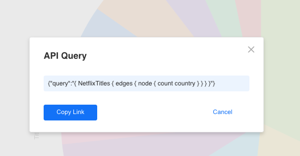
Copy API Query #
Allows you to copy the API query of your Report, or run it in a new Tab.
Export #
Allows you export your Report as CSV, PDF or PNG.
Share #
Allows you to share the link of your Report. This operation will copy the report link to the clipboard.
Schedule #
Allows you to schedule your Report by specifying the rules of scheduling including format (CSV, PDF or PNG), the email recipients and the frequency:
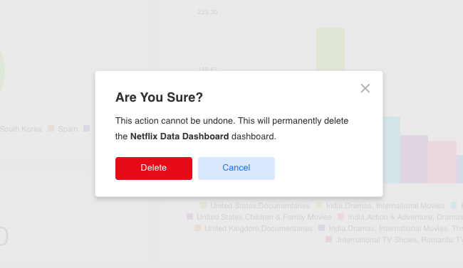
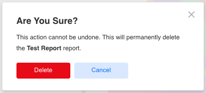
Delete #
Allows you to delete your Report.
Operations on Dashboards #
Add to Favorites #
Allows you to add your dashboard to the favorite bucket.
+ Add Widget #
Allows you to add a widget to the dashboard.
Clone #
Creates an exact copy of a dashboard with the name “Copy of ….”.
Export #
Allows you export your Dashboard as PDF or PNG.
Share #
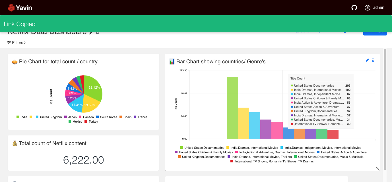
Allows you to share the link for your Dashboard. This operation will copy the dashboard link to the clipboard
Schedule #
Allows you to schedule your Dashboard by specifying the rules of scheduling including format (PDF or PNG), the email recipients and the frequency:
Delete #
Allows you to delete your Dashboard.